Untitled from Media Group on Vimeo.

Please note: The original quality of this video has been reduced by Vimeo. To see the video in its full quality, click here

Saturday, 12 March 2011

Evaluation Question 4

How did you use media technologies in the construction and research, planning and evaluation stages?

From start to finish, all stages of our work were dependent on various technologies, without which our end result would have been impossible.

The first stage of our work was to create a Blog on the website Blogger.com, but before we could do this we each had to create a Google Email address. Once we had created an email address, we gave our blogs titles and customized their layouts. This blog would provide the canvas upon which all stages our work would be displayed. We used blogger as a means of creating, organizing, and displaying our work. From our research, to the final cut and right up to the evaluation I am writing now, everything was to be displayed on Blogger.


Blogger was also used to communicate with our teacher, as another Blog created by her would offer the class important information such as help or deadlines, and this made organization easier.

Once the blogs were up and running, we had to begin our research. The primary browsing software I used was Mozilla Firefox, which enabled me to easily navigate through the internet and to websites that would provide me with the information I needed in my research.


I made use of many different websites in my work, and there are far to many to list. However some of the main and most important sites other than Blogger were:

- This was essential in our research stages, as it allowed us to view other media works, and learn the conventions we would have to meet when we did our own work.

- The social networking site provided vital communications between the group, and was important when it came to organizing activities such as filming, or simply sending each other ideas or images of the work.

- This website was used to post our work, which could then be embedded on our blogs. Without it we would not be able to share our work, which would have damaged our ability to get feedback.

UK Tribes - This was very important for researching the different social groups and played a large role in giving us the knowledge we needed about our target audience.

Those are some of the important websites we used when we were creating our work. All of our work was done on an Apple IMac. This is a fast and reliable computer, without which we would have had to work much slower on a home PC. The mac was used as our main work station, and it provided a very useful and convenient role


The mac was not the only hardware we used, once our research was done we were ready to film our project. This required a Sony OCR HC62 camera supplied by school to capture all the footage and a mini DV tape to record it all on.

Once we had recorded all of our footage it needed to be edited. We used Apple Final Cut to edit our video. We used the tools on this program to bring our idea to life, without it many things such a colour correction would have been impossible and many of the more complex areas of editing such as getting the timing of the audio and video right would have been made far more difficult if we had to use an inferior program.

Before our song was ready to enter Final Cut however, it had to be cut down and altered slightly. To do this we used software called Garage Band.

To see how we used Garage Band and Final Cut, click here

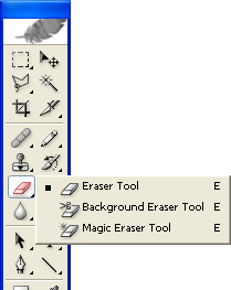
Once our video had been fully edited and finished, we moved onto the ancillary task. The ancillary task was created entirely on Adobe Photoshop. Without Photoshop's extensive and complex features such as blending modes, layers and filters many of the effects on out images would not have been possible. Photoshop was used to the full extent of my knowledge and without it out ancillary task would have been inferior to the one we have now.

To see an example of how we used Photoshop, click here

We used one image in our ancillary task, and it was taken on an Apple Iphone 4. Not only did we use the Iphone to take many pictures. It was also used to film a video of our audience feedback, and an application installed on it called 'Itorch 4' was used to create the strobe lighting on our videos into.

Our ancillary task also needed a good font, and we used a website called dafont.com to search for a good font that was fitting to our genre.

Imovie was also used in stages of our work. It was more fitting to use Imovie when creating a video of audience feedback, as it is designed to have a simple interface for creating short films. Without Imove, I would have had to go through the longer process of using final cut, which although superior to Imovie is many aspects, would have slowed me down.

Finally, and probably most importantly, most of this would not be possible without the internet. We used to internet to research, plan, communicate, post and evaluate our work. Without it research would have been nearly impossible, and sharing the work would have been very difficult. The internet has allowed us to function better and quicker, and provided us with a platform upon which other technologies can be used.

So overall, we were highly dependent of technologies in all stages of our work, and used many of them to their full extent to create a project of professional standard.

Monday, 28 February 2011

Evaluation Question 2

How effective is the combination of your main product and ancillary texts?

To measure how effective the combination of our main project (the music video) and our ancillary texts (the magazine poster and the digipak) are, we must first see how well they combine in real products of the same genre. For example, here is the album artwork and magazine advert from Tinie Tempah's 'Written in the Stars':


It is obvious to see straight away that the two are from the same product. There are many notable features that link the pictures to each other:
  • The picture used is the same on each
  • The text used in each follows the consistent house style
  • The colours are the same
So they link in well with each other, but how well does this combine with the video? Here are some screen shots from the a scene in the video of Written in the Stars that links in well with the images:

Clothing and accessories (e.g. Sunglasses) match that of the images

The colour scheme and blue tint on the video is similar to that of the images

The artist's pose in the images can also be seen in the video

The images also link in with the concept of the video:
  • A blend of stars and other elements of space are in the image
  • The artist's pose looks like he is deep in thought, and the low angle shot makes him look powerful and important, linking in with the theme of destiny in 'Written in the Stars'
We can see from the above example that to combine effectively with each other, a music video, a digipak and a magazine poster must all conform to a consistant house style. We can see that things like text, colour, mise en scene and concept all form the house style. Knowing this, how well does our project follow a house style?

Our Work

We must first identify important symbols and themes in our video that collectively form part our house style:
  • Fireworks, fire, burning
  • The girl, photographs
  • A feeling of reflection on the past, reminiscence, regret
These themes were strong in our video, and so it made sense that to effectively combine our ancillary task with it, they must carry over to the images we make. Our video was about the burning up of relationships, shown metaphorically by Remi's acting and literally by the burning photo at the end; It also carried a theme of fireworks, as a metaphor for a troubled mind. In order to link our ancially task into the video, we felt it necessary to carry over this concept into our images:

Aside from retaining consistency in our concept, we also had to keep the text consistant. There is no text in the video, but everything written on our ancillary images is in the font 'Roadway', this helps to indentify the products as coming from the same group.


The continuity of the font helped to link and combine all elements in our ancillary task, but it created no links to the video. To further link to our video, we used similar colour schemes in our ancillary task as we did in our main to help combine the two together, as well as link the ancillary in with itself. I think that this was a very effective way of combining the two as, similar to the artwork for 'Written in the Stars', it allows a clear visible link to exist between the two parts of the project, and along with the links in the concepts between each, ensured that both sides of our work were reconised to be related.


I think that our ancillary task and our music video combine very effectively. We have a continuous concept, colour scheme and font and image through all our work. I think it would be clear to an audience that aspects of our work are all from the same project.


Monday, 21 February 2011

Evaluation - Question 3

What have you learned from your audience feedback?

A music video is judged on how the viewer responds to it. It is created for a specific target audience, so it is logical to ensure we receive feedback from the said audience when making our video. After gathering a number of individuals within the bracket of our audience to view the rough cut of our video, we collected their critical feedback. Each person viewing the rough cut was given a small piece of paper and asked to write their opinions on our video and sugest areas that could be improved. Here are the slips returned to us:

We noticed that alot of the people who watched the video had observed problems in lip syncing, both from our actor and from our timing with the music. These problems were corrected by using different scenes over areas of poor miming from our actor (as we filmed each verse several times in several locations) and by reshuffling the video on final cut so that is synced with with the music better.
Another problem people spotted was the fact that the burning scene at the end, while many said it was good, had no real relevance to our video. To fix this, we added two new scenes, one with a picture of the girl, in which it is clear there is a history between the two, and another in which we see Remi (our actor) striking a match and setting the picture on fire. Paried with the stamping of the framed picture earlier, we hope we have made it clear that he is angry with this girl and that there is a complex history between the two.
Finally, many people noticed that the scene in which Remi drinks vodka is not very realistic, as it is clear that he does not actually drink it. Unfortunately, we are unable to fix this at this late stage as we no longer have the resources we need to do so.

Finally, we interviewed a section of our target audience to see what they thought of our final work. here is is:

Tuesday, 15 February 2011

Evaluation Question 1

In what ways does your media project use, develop or challenge forms and conventions of real media products?

To understand how our project relates to conventions of other products we had to first understand what they were. Through our research we discovered the forms and conventions of a R&B video. Andrew Goowin's theory defines conventions like so:

ANDREW GOOWIN’S THEORY • Visuals either illustrate, amplify or contradict the lyrics and music.
• Genres often have their own music style/iconography.
• Close ups should always be included.
• The artist/band might want o develop their own star iconography, which become their stars image, Voyeurism is common theme within music videos
• Intertextual references are also popular.
• Goodwin argues that the female performer is frequently objectified principally for display purposes, often through a combination of camera work and editing with fragmented body shots emphasising a sexualised treatment of the star.


By this theory, our video fits well into the forms and conventions of a music video as:
  • Our visuals both illustrate and amplify the lyrics of the music. Lyrics are sometimes illustrated, such as when Drake said 'that's who I make the paper with' Remi chucked money over his shoulder, to show he has it in abundance. At other times lyrics are amplified, such as when Drake says 'where's the magic' in a prolonged tone, Remi's actions reflect a similar mood, the lyrics as a whole are amplified by the feel of our video.
  • We use close upsto show Remi's emotion
  • Remi is presented in a consistent style throughout the various areas of our work
  • The female in our video is for display purposes, but not objectified, she helps tell the story.
Our video also fits into the sub conventions of our R&B genre, breaking the genre down into its various aspects, we can see how our video fits in with others in the same/a similar genre:


(click to enlarge)

So our video followed and used conventions in its use of colour correction, transitions and shots, but challenged the conventions of our genre with its narrative, which is usually reserved for more indie music. Our use of mise en scene both challenged and conformed to conventions in its use clothing, Formal and casual clothing are both conventional, but blending the two is rare. Our videos ending with the burning picture defies convention in its duration and style. However we felt it fit well into our video and genre, despite not being conventional. I think here we have successfully challenged a convention with good effect.

Like the ending, the intro was also unique to our work and didnt't use convention. However most videos in our genre have their own unique type of beginning. For example 'Dead and Gone' starts with a bible quote, 'Whatever you like' starts with a short story and the intro to 'Not afraid' is a slow zoom into Eminem standing on a roof. It seemed there was no set convention on how to open videos in this genre, other than to do it your own way. So I think that while being uncommon, our firework overlay and cuts to different scenes are, although unique, conventional.


Our video also contains other, rarer features of music videos. However they still do all use develop and challenge conventions of real products:

Our use of height in the video makes use of a trait we noticed scattered around videos in our genre. 'Written in the Stars' is a good example of where height has been used to good effect in a music video. Our video uses this convention to achieve a similar effect.

Our video also makes use of Strobe lighting, as is seen in some professional works. However we developed the convention further by using it with a firework overlay, making the Strobe light add to the firework effect were trying to create.

Finally, all professional music videos have a correlation between the audio and video, and it is this that allows the video to flow well and draw in the audience. It is an important convention, and our video makes use of it by using a different style in different areas. When Drakw was rapping, or singing his part of the chours, then the camera would be mostly moving, like the verses. But when it came to Alicia Key's pert of the song, which is much slower and more relaxed that Drake's part, we slowed the video down to match. In these slowed down sequences, we told our story. Another example is at the end of the video; the song trails off slowly, so we made the video do the same with an extended shot of a burning photograph, that I think made a nice, conventional conclusion to our work.

Ancillary Task


Like our video, our ancillary task images use, challenge and develop convention. Below, I have compared our works with similar professional works.

In our album's front cover we use, develop and challenge the forms and conventions of real media products, Our use of a firework overlay is not common, but is not unconventional, as overlays can be seen in album covers such as Tinie Tempah's 'Written in the Stars'. Our use of Font is also conventional, as we used strong bold lettering, as can be seen on T.I's 'Whatever you Like'. We did not use an image on our cover, when convention dictated that we must, here we develop conventions from other genres, such as House (a good example is 'When Love Takes Over') and bring them into our genre effectively.

Our CD challenged convention more than any other piece of work we did. A conventional CD artwork from our genre would be dark, plain and have something linking to the album (such as bullet holes). In our work we made a fairly light cover to fit into our product's house style, but we did use conventional fonts and layouts, so it will be identified as part of our genre. The burning effects used however, I think are conventional as they link into the theme of our work, which is a feature seen on many others.

Our poster also challenged conventions of our genre. We used a 'stamp' effect to make the image of our artist look like it had been drawn, this fitted into the paper/burning theme of our work. A conventional magazine poster fits the themes of the music and the album, which ours has done, although it does not look clear and neat like a conventional poster of our genre. We did this deliberatly, developing conventions from the rock genre, where our style of poster is common, and bringing it over to our work.

Our work as a whole mostly uses conventions of real media products, however it does contain aspects from other genres and develop on them to fit our style. In doing this it often challenges conventons allready in place.


Sunday, 9 January 2011

Creating the new disc art

The stages of creation for our disc, from importing a blank CD template into photoshop to this the image below, were exactly the same as seen on the creation of the magazines poster. As they were produced using exactly the same methods and tools. However the disc has one further stage that was not on the poster.


We wanted to add a burnt effect to the disc to link into our video's style. To make the image look like it could burn, we overlayed the below image of paper texture:


Then, we used the eraser tool to rub out parts of the cd, and these bits would be the bits that had been burned away.


Next, I used the paint brush tool to paint the edges of the burn area a darker brown, and then used an innerglow by clicking layer>layer style>innerglow. This effect would be made dark and would make the rubbed out edges look as if they had been burned. This prodiced the final result below:

Saturday, 8 January 2011

Creation of Magazine poster ad

Using a blank A4 canvas, I simply used the rectangle shape tool to create black rectangles on the white background by dragging the mouse from the point where I wanted the shape to start to the point I wanted it to end.


These stripes would each play host to a line of text on our poster.


Next I added the text using the horizontal type tool.


The font used was our house style font 'Roadway'. I used the free transform tool to place the text where I wanted it by pressing ctrl+T. I then changed the colour of each line of text so that it would be the opposite to the colour of the stripe it was on. Do do this I just highlighted the text and clicked the colour box so that I could choose a new colour, then clicked OK. These steps produced the following:


Next we had to add a picture of Remi, the artist featured in our video. First we had to chose from some images taken on an iphone 4. Here are some of the images we had to chose from:


The top image is the one we chose to go on our poster. Before it was ready however, we had to import it into Photoshop and then cut it away from the background using the polygonal lasso tool.


I then deleted the background of the photo and dragged the layer containing Remi onto our poster image, resized it using the free transform tool and placed it where I wanted it. However to fit the style of the poster, we had to edit the image. By clicking filter>sketch>stamp, we applied the stamp effect to remi's image. This gave us the following:


Finally, as with the CD cover, we applied an orange gradient using the gradient tool after importing a the logo for our record label and a 4-star rating from google images into our picture and placing them where we wanted. We also added the websites such as that of our label as well as logos fitting to our work. This produced the final product - shown below:

Friday, 7 January 2011

Creating/Editing the video

Once everything was filmed, we had to edit our video using Apple Final Cut Express. The first stage was to open final cut and create a new project, providing us with the canvas on which our video will be made:


We then uploaded our footage from the camera to final cut and placed it in the browser. This is where raw, unedited footage is stored and can later be brought down into the timeline to be cut and edited.


Once this was done, we had to upload our audio so that the two could be put together, we uploaded the song in a AIFF format as this is the only format accepted by final cut. We needed the audio so that we could sync our video with our song. It then appeared in the browser, and was dragged into the timeline:


Before we could bring our song into our video however, we had to first make some small adjustments to it. For this we used garage band. We cut 13 seconds off the end by using the master volume function, making the audio fade out at the point we wanted:


Now that everything was in the right place we were able to get on with editing our video. Here's how:


First of all we would select the footage we wanted for a certain part of our song. (in the above case, the beginning) and drag it into viewer for a preview. If it was the part we wanted, it would then be dragged into the timeline where it could be cut and synced to run in time with our song.

Footage placed in the timeline would look like this:


We would then use the indicated razor blade tool to cut the video down into its various useful frames. Unwanted areas could be sectioned from the rest with the razor blade tool and then deleted, whereas wanted footage could be detached from the main footage and moved around as we please. The first cut of the project is shown below:


This process was repeated with all needed footage until we had our near-end result. The video with all cuts completed is shown below:


Now that all our cuts were in place, the video was almost done. However it still was not finished as we had to add our transitions. After deciding that cross dissolves best fitted our work, we selected them in the effects tab and dragged them over all of the cuts to make them cross dissolves:


The video at this stage was almost complete, but to give it a more professional effect, we added colour correction.


Some parts of the video, such as the burning picture at the end, needed to be slowed down in order to fit into our video better. For this we needed to change the speed settings of selected footage. To edit the speed of a clip, you need to right click it and click 'speed'. From here a window will appear that looks like this:


100% is the setting for the original, unedited speed. To slow clips down, we needed to decrease the percentage to a setting we felt fitted the music, like so:


Now that the speed, colour and order had all been corrected as we desired. We needed to add some final touches to make the video look like it was from a music channel. To do this we added a watermark logo and flashbar from 'Viva' into our work. Both were made on Photoshop are are shown below:


To bring both images into our work, we had to add them to the timeline, creating the style of a music video. The flash bar would be on screen for the first 4 seconds, and the watermark logo would be in the top left hand corner for the duration of the video, and so it was streched to cover the length of the audio.