Untitled from Media Group on Vimeo.

Please note: The original quality of this video has been reduced by Vimeo. To see the video in its full quality, click here

Showing posts with label Ancillary Task Research/Planning/Production. Show all posts

Sunday, 9 January 2011

Creating the new disc art

The stages of creation for our disc, from importing a blank CD template into photoshop to this the image below, were exactly the same as seen on the creation of the magazines poster. As they were produced using exactly the same methods and tools. However the disc has one further stage that was not on the poster.


We wanted to add a burnt effect to the disc to link into our video's style. To make the image look like it could burn, we overlayed the below image of paper texture:


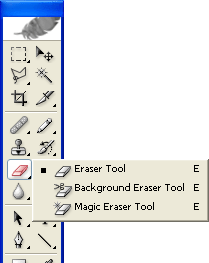
Then, we used the eraser tool to rub out parts of the cd, and these bits would be the bits that had been burned away.


Next, I used the paint brush tool to paint the edges of the burn area a darker brown, and then used an innerglow by clicking layer>layer style>innerglow. This effect would be made dark and would make the rubbed out edges look as if they had been burned. This prodiced the final result below:

Saturday, 8 January 2011

Creation of Magazine poster ad

Using a blank A4 canvas, I simply used the rectangle shape tool to create black rectangles on the white background by dragging the mouse from the point where I wanted the shape to start to the point I wanted it to end.


These stripes would each play host to a line of text on our poster.


Next I added the text using the horizontal type tool.


The font used was our house style font 'Roadway'. I used the free transform tool to place the text where I wanted it by pressing ctrl+T. I then changed the colour of each line of text so that it would be the opposite to the colour of the stripe it was on. Do do this I just highlighted the text and clicked the colour box so that I could choose a new colour, then clicked OK. These steps produced the following:


Next we had to add a picture of Remi, the artist featured in our video. First we had to chose from some images taken on an iphone 4. Here are some of the images we had to chose from:


The top image is the one we chose to go on our poster. Before it was ready however, we had to import it into Photoshop and then cut it away from the background using the polygonal lasso tool.


I then deleted the background of the photo and dragged the layer containing Remi onto our poster image, resized it using the free transform tool and placed it where I wanted it. However to fit the style of the poster, we had to edit the image. By clicking filter>sketch>stamp, we applied the stamp effect to remi's image. This gave us the following:


Finally, as with the CD cover, we applied an orange gradient using the gradient tool after importing a the logo for our record label and a 4-star rating from google images into our picture and placing them where we wanted. We also added the websites such as that of our label as well as logos fitting to our work. This produced the final product - shown below:

Thursday, 6 January 2011

Creating the CD outside cover art

As the song is called 'fireworks', we thought it would be only fitting to have the front cover reflect this in some way. In our research we had observed a few main features of CD covers in our genre.
- Bold Text in a clear and bold font
- Not all covers had artist images
- Use of vibrant colour

We have decided against using a picture of our artist as one will be featured on our magazine advert. We have also decided to use a theme of fireworks overlaying clear and bold text. Below you is a rough design of our idea:

FRONT COVER

This is a rough layout we intent to use on our cover, over a black background. We are aiming for a simplistic style in our design.

From here, we created our entire cover on Adobe Photoshop, here's how:

We first created a new document w the dimensions being 12x12 inches

We then created our background layer, using fill tool on the document we created to make it black.

We now have our canvas. The next stage required us to find images of fireworks that we could then manipulate into looking like the clip art styled images we need.

We found a suitable image of a firework through searches on google. We then imported the said image into photoshop. First we desaturated it to make it black and white by clicking Image>Adjustments>Hugh/Saturation... We than applied the following settings:

Now the image had become black and white, we had to apply an effect that would give it the clip art like appearance. We chose the stamp effect by clicking Filter>Sketch>Stamp... We then applied the following settings:


We then duplicated the result so we had two copies of the firework clip art on our document. We used a colour overlay to make them both white and placed then where we thought best. Here is the result:


Now we had the fireworks in place, it was time to add the text. We searched dafont.com for a suitable font and we discovered on named 'Roadway', we imported this font into photoshop and, following the rough layout of our plan, added the text to the image using the Horizontal type tool tool.


We then changed the colours of of text. To a pale orange and a very slightly orange tinted white. We also placed the text and changed its size by clicking Edit>Transform>Free Transform. Here is the result.

We then added a gradient to give an orange theme to the front cover. The gradient was added with the gradient tool on the sidebar and the following settings:


We also added the compulsory parental advisory logo into the bottom corner and here is the result:


The bulk of the work is now done, but we still need to add the effects that will give a professional look to our cover. First of all, I wanted to give the cover some paper texture so that it carried a similar style to the poster and our disc, which are all paper themed. I found that many of the photoshop effects available to me were not good enough as they were too neat and structured in their design, so i decided to find an image of paper texture through google. This is what I chose:

Once placed in the document, this image obviously needed some editing before it gave the desired effect. First we had to set the blending mode to overlay in the layer pallet so that the image would blend in with our cover. However this was to strong so the opacity had to be changed, these are the setting given to the layer:


This produced the following:

Now the cover is almost complete, all that remains is to overlay the firework images, again found in google, to give our front cover the final touches it needed. The following images were found:

Once placed into the cover image, these layers were both given the blend mode of overlay and each had their opacity changed to levels that suited us. Once we were happy with the result, we readded the parental advisory logo and we were finished. Here is the end result:


BACK COVER


Click to enlarge


SPINE

Creation of the spine was quick and easy. The spine is 0.8 inches wide and 12 inches in length. As with the front cover and the back cover, we followed a number of stages.
-background of spine set to black
-Roadway font, Horizontal Type Tool and Free Transform used to make the text span the entire spine as seen on many covers we researched.
- Text set to the same pale orange and orange tinted white colours as used in the front cover stages.
-Young Money record label logo imported from google and placed at the top of spine, as seen on other young money CDs.
-Finally, a firework image added on a layer over everything. The blend mode is set to overlay and opacity is changed, as before.

Here is the final result:


Monday, 6 December 2010

Magazie advert - research

Features of regular magazine poster adverts shown above. We need get an idea of how they look so we can create our own concept that fits our idea. Most of the posters looked at had their own unique design, with common features such as the artist name and album name. Many also had pictures of the artist. We will make sure our work follows this style.

Saturday, 4 December 2010

Digipak inside cover research


The left side will be open and therefore would normally have much more detail then the right panel as that will have the CD covering it most of the time. On the left panel there is normally have another track listing as well as having information about the writers and producers. At the bottom there also normally consists various music labels and logos.

Friday, 3 December 2010

Digipak research - Album artwork

Digipaks are a patented style of compact disc packaging. They typically consist of a book-style, paperboard or card stock outer binding, with one or more plastic trays capable of holding a CD attached to the inside. Digipaks were among the first alternatives to jewel cases to be used by major record companies. Digipak-style packaging is often used for CD singles or special editions of CD albums.

An Oversight

Digipaks consist of either a triple layout (pictures below), or just the layout of a normal CD, only it is printed on this card rather than put into a plastic case. We will likely use the normal CD layout as more information and examples are available to us.


The most important feature of the digipak will be its front cover as this is the main artwork and everything else is designed to compliment it. Here are some examples of digipak and normal CD artworks in our hip-hop/urban genre, as the conventions and styles remain the same for each.


The most prominent feature of our genre's artwork is probably the use of simple font in capital letters. Other than that, there appears to be a large variation in the use of colour, images and styles. This is good because it leaves our group with a large area to work in.

The Back


The back of digipaks are usually much more simple than the front. They contain a simple image and a list of the tracks present, along with various credits to their partners. They maintain the same house style as the front.

Closer Analysis


Features of all digipaks

Parental Advisory notice

This had to be added as there is graphic content in the song we have chosen to work with. It is a compulsory feature of all CD artwork. We will need to find a place for it on our album cover


The Bar Code

A bar code is a machine readable representation of data, anything sold in a shop needs one, so our group will have to find a place for this on the back of our digipak


Record Label Logo

Many digipaks played host to the record label of the song they contain, our group will likely embed the 'young money entertainment' logo into our digipak


Recycling Logo

Many digipaks had this logo on this somewhere, most were in green but this black and white one would be more fitting to our scheme.